
Don't Over Order Food
AR solution to help customers visualize portion size of restaurant food
Overview
Challenge
One of the major sources of food waste is at restaurants where leftover food from plates is thrown away regularly. Many times this happens due to customers ordering more than they can eat : “over-ordering”, as they do not know the portion size of food items.
Solution
We designed DOOF : an Augmented Reality mobile menu application that let’s users visualize portion size of the food items and place their order through the app. The visualization aids their decision-making process.
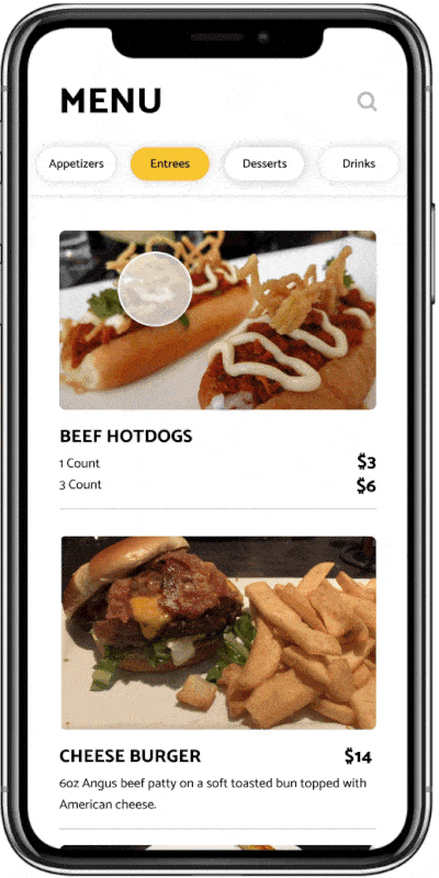
Explore the food menu
Scroll through the menu, and see all the food options within various food categories. See important information like price as well.

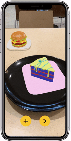
Visualize food in AR
Select one or more food options and see them placed on your table! Tap on the food to see more information about it.
Project Details
Role
UX designer & Researcher
I worked on synthesizing insights, ideation, concept sketching, visual iteration, prototyping for this project.
Tools
Figma
Adobe Aero
Adobe Photoshop
Team Members
Nan
Jaz
Isaac
Riya
Timeline
Sep 2019 - Dec 2019
(a semester)
Process
Research
Literature Review
Pictorials
Stakeholder analysis
Interviews
Concept
Divergent Thinking
Sketching
Wireframing
Prototype
Wizard of Oz
Iterative Prototyping
Evaluation
User Testing
User Feedback
Research
Exploration
Food waste is a vast problem space, and as designers we wanted to explore it as exhaustively as possible before narrowing down on a particular area. Hence, we started with the initial goal of exploring the food waste cycle in depth. To get insights, we employed various research methods:
Literature Review
Pictorials
Stakeholder Analysis
Interviews

In pic: Stakeholder analysis
We created an exhaustive list of stakeholders involved in the food supply chain to understand how they interact with each other.
Roughly 50 % of all produce in the United States is thrown away - some 60 million tons (or $160 billion) worth of produce annually.
I’m a paragraph. Double click here or click Edit Text to add some text of your own or to change the font. This is the place for you to tell your site visitors a little bit about you and your services.

Waste by Food Retailers

‘Selling as much food as possible is a tried, tested and ingrained part of all-you-can-eat cultures.’ Grocery stores want to promote and sell as much food products as possible. The shelves are always kept fully stocked to keep up an appearance of abundance, as part of the store’s business image. But many times these products don’t end up selling and become part of food waste.
One possible by solution by Finland’s S-market has been to introduce a ‘Happy hour’ concept where they slash prices certain times in the week, allowing shoppers to buy products which otherwise might have been costly for them.
Waste by Consumers
Consumers often buy more produce than they need. After stocking their kitchen cabinet or fridge, people can ultimately forget about certain products which end up being thrown away. Another contributing factor is format of expiry dates in US. They can confuse consumers as different phrases are used to indicate freshness or expiry: "use before," "sell by," "expires on”.
Various solutions like smart fridges etc. are in development to combat this issue.
Waste in Restaurants
‘About 1.3 billion tons of food are wasted globally each year, and around 40% of that comes from restaurants.’ Only 15% of the food waste is recycled while the rest is sent to landfills.
“For a large company with $ 1 billion in revenues, average food waste generation (based on survey results) would be 33 million pounds.”
Consumers many time order more food than needed which they are then not able to complete.

Concept
Divergent Thinking
As we began concepting possible ways to address the issue of food waste we decided to engage in divergent thinking. We conducted a design-studio style ideation process, where we drew wildly creative ideas on whiteboards, without worrying about feasibility at this stage. At each stage, we either drew new concepts or iterated on existing ones. Some sketches are shown below.


A creative concept I had drawn intrigued us. It was ‘Body scan Restaurant’: Futuristic technology which can calculate your appetite through body scans, and size your meal accordingly. The idea behind the concept was to help consumers eat only as much as they needed in restaurants.
Upon further iteration, we realized a realistic way to do that was letting consumers envision the correct portion size of dishes before ordering. To make the idea more feasible and readily available, we decided the form of this concept should use AR technology.

From our 3 key players, we now decided to focus on : Restaurants
More Research on Restaurants
To get more insights into the issue, we conducted exploratory interviews with individual staff members at local and chain restaurants, about food waste and difficulties in conveying food size.
“We would have anywhere from 10-12 trash cans in a line, so that we could just scrape that food waste into the trash. And they would get changed probably every half hour to an hour.”
- Waiter, Local Food chain
“Working at a steakhouse we have multiple different size steaks. So when a customer asks about food size, we try using hand gestures - make circles with our fingers. But without them seeing it in front of them it is really difficult for them to see what the actual size is.”
- Waiter, Texas Roadhouse
I also looked at current ways restaurants use to possibly convey the food size, and found 3 major ones:

Serves 12
Food menus indicate the size by putting the number of people it feeds.
But this doesn’t always take into account different user appetites, and doesn’t help user to properly visualize the size.

Descriptive Size on display
In picture: A Boba tea stall where size is indicated by putting out the actual vessel (cup here) near the menu.
This works great for certain use cases but isn’t practical enough for diverse restaurants with many food options.

Actual Food on display
Some small restaurants help users understand the feel and look of the food item by putting the actual food on display.
This might work for small scale restaurants but is not a sustainable method. It is also not feasible for bigger restaurants with a whole array of food options.
Our design goal became clearer :
Design a restaurant menu experience to help customers decide how much food they want to order
Iterations & Final Design
Paper Prototype + Wizard of Oz Test
We created a paper prototype to gather quick feedback on our idea before beginning to create the wireframes. We printed out pictures of food and cut out the outline of an iphone to simulate our application. We proceeded to conduct two rounds of Wizard of Oz testing with four participants.
The flow went as such: conduct interviews with two participants, ask questions and receive feedback, make adjustments based off critique, conduct interviews with two new participants, ask questions and receive feedback.


From participants’ feedback we learnt that:
-
All the participants liked the fact that they could visualize their food options.
-
But seeing all the food options at once can be disorienting. We need a way to help them visualize in a way that doesn’t intimidate them.
-
People want to see food items in categories so that it aids their decision making.
-
Additional information like price, calories needs to be visible easily.
Wizard of Oz Testing where one of our team members would simulate the actions of a real app
High Fidelity Prototype


Welcome
Customer enters the restaurant, opens the app and can scan the QR code found on restaurant tables. This opens up the menu.
Design decision: We used mustard yellow as our major colour to invoke joyfulness, and represent how most foods have some yellow in them.
Menu
The menu lists all the food items the restaurant offers, along with price, description and category. Customers can browse the menu through vertical scrolling.
Design decision: We included price, description, and vertical scrolling to emulate the experience of an actual menu.

Augmented Reality
Customer can select something they like with a tap. The application then shows them the food item’s AR rendition. They can learn more about the item by tapping on them. Food in your cart will be shown on the table behind the current item. This allows them to visualize their entire meal at once. Customers can tap on ‘+’ to add item to cart.
Incorporated feedback: Using actual plates which will act as size reference for user, to aid their visualization. I also added visual indication when the user taps on the ‘+’ button to confirm it had been added to their order.

Order
Once the order is placed in the app, the waiters will bring food to their table. The app also shows them the estimated arrival time of their food.
Prototype in Action
Reflections
Design process is not always a straight line from research to concept generation. By the end of our first research phase, we hadn’t yet narrowed down to any particular sub-space. During our studio ideation session, once we collectively found the restaurant idea interesting we went back and performed more research specifically on restaurants. This in turn helped us flesh out the idea and take concrete steps towards designing it.
As a team of 4 visual thinkers, we decided to use our strengths and research or present our findings through visual mediums (pictorials, stakeholder maps…).
Quick iterations in prototyping helped us save considerable time and effort. Getting user feedback earlier in our creation process helped us have a proper direction for our visual prototype. Quick iteration in concept generation
helped us generate 40 or more sketches, which got us out of a creative block.
Overall, it was a fulfilling experience for me to design a product which could not only satisfy user needs but also have a social impact through food waste reduction.